Painting the emotion "Disturbed"

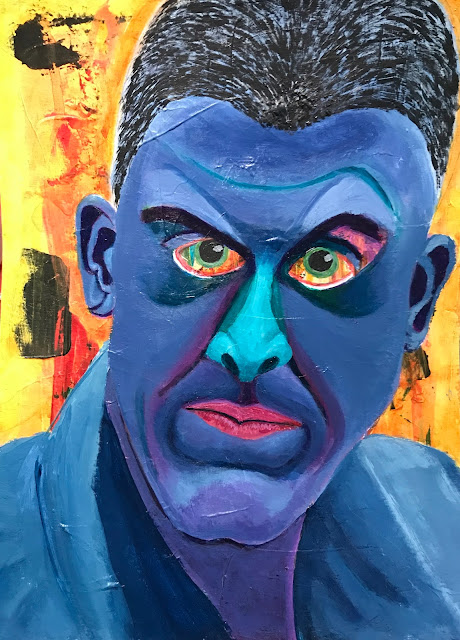
As part of Ardith Goodwin's Land of Ardithian Color - Color Class, one of our assignments was to paint a quick piece that conveys the emotion of disturbed.  

I took a bit more time with my effort starting with a substrate that had random paint marks on it, then sketched an outline over it (see second photo).   The finished effort is the man in blue below.  The whites of his eyes are the actual background pattern/color of the paper I started with and left the way it was--because the eyes appear intense and striking that way.

The blues in the piece were achieved with the use of Phthalo Turquoise (as in the nose) and dark violet (mixed with the turquoise for the skin color + grey).  

The buzz cut for the hair was challenging to do with a paint brush, but works.  Another problem was my paint dried (developed a skin) far too quickly.  So, color mixing had to be done over and over again as this was coming together.  Aside from that--overall, I really like how this turned out.  The image has a quality of 'perturbed' that is a synonym for disturbed.  


#colorishere
Comments

Popular posts from this blog

Highjacked Blog Photo

My profile photo was highjacked ! For those of you who are blogging, be wary. There are some unscrupulous folks out there who may be using or about to use a photo(s) you've uploaded to an online photo-hosting site. At the time I created a blog, having a URL for a photo uploaded online was the only way to insert a photo in your profile or to create a custom header. There had been no problems for a long while. This morning, however, I did a Google image search for my name and found my photo linked to a totally different blog than my own! It is possible I didn't mark my file with the online photo-hosting site as private, but I didn't expect this to happen. I don't know whether marking it private would have actually averted the situation, but I'm not waiting to find out. I eliminated my membership to that online photo-hosting service today and caution anyone to be careful with uploading images to the internet . If you read the terms of agreement at many sites, you'...

Life Book 15 - Week 36 Project Completed (or nearly completed)

This project went in an entirely different direction than the Life Book 2015 lesson.  That's ok because we're also working on accepting those times when we move in our own direction using the lesson purely as a launching point. This piece involved experimenting with collage on a substrate (muslin covered with joint compound), followed with paint, more collage, and then the felt, fabric and beaded plant. This piece was created through a class offered by Tamara Laporte from Willing Arts Ltd. For more information, visit this link:  www.willowing.org .

Get to Work and Get Clear - Stop the Waffling

I haven't painted in some time. So it seemed like the perfect time to sign up for Louise Fletcher's 10-day free taster course titled 'The Creative Reset' that recently started.  She has re-engineered the taster since I took it last, and I'm liking how it is rolling out.  The images below are from our first lesson that were timed studies with additional constraints.  The purpose was not to have finished pieces.  Rather it was to help students identify their preferences and gain clarity about our likes.  This means not choosing to like what others want us to like or think we should, but what we honestly like.     From my six-block painted sheets, I chose one favorite from the first grouping and two favorites from the second grouping.  The step I'm choosing to do is to write down why I like those three in particular.  The reason is because being able to articulate my reasoning will help clarify, strengthen and hone my voice -- not just in art bu...