As part of keeping an art journal in Louise Fletcher's 2023 Find Your Joy (FYJ) course, one part is exploring works we like and writing about why we like them.
Over the weekend, a post in a private Facebook group (of Louise's) was about one 'Portrait of the Year' competition. In it, the posting party mentioned that writing what you see in a piece is more fruitful than just thinking about it, and doing this for your own work can help in seeing it less subjectively. That triggered a thought, because of the writing to do for FYJ.
That Facebook post triggered a recollection of an art exhibit I saw years ago that I was awed by. So, I decided to look for the exhibit publication (saved), and research the artist and his other works. My plan was to write about what I thought I had liked in the artist's work when I first saw it, decide whether I still like it. and if so, whether for the same or different reasons. I also wondered if I could articulate the 'why' better now because of what I've learned/unlearned over the years.
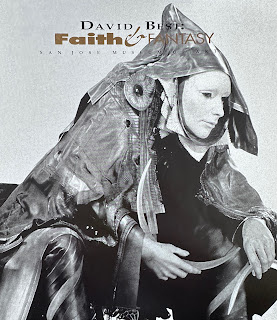
David Best is described as a scultptor based on an internet search today. I knew nothing of him in 1991-1992. It was sometime between December 1 and March 8 of those respective years that I saw his exhibit titled 'Faith & Fantasy' at the San Jose Museum of Art and was gobsmacked!! (See the cover photo of the publication below.) I think the words I would have used back then to describe the exhibit are haunting, beautiful, extraordinarily well-crafted, and mystical/philosophical.
Today, I re-read the publication (yes, successfully found it). The words I came up with are pretty close to the narrative's description. I'd use the same descriptors today. Do I still like it? Yes, absolutely...I love it, in fact!
The really interesting fact about David is that he has designed/built at least half of the temples at 'Burning Man' over the last quarter century. These are the installations put together in the desert for the entire length of the Burning Man festival and then burned down at the end. He describes them as sacred spaces for people to remember, process, heal and/or find relief from, and/or acknowledge and forgive the people they've lost and loved through death/endings of whatever kind. I've seen photos of some of the structures over time and wondered who the amazing creative was behind them. Now, I know.
I watched one video of him addressing an audience at the Smithsonian where he built a temple space inside the Renwick Gallery...again, a sacred space construction. He talked about people who write the names of their beloveds on the wooden walls, or leave notes, poems or other mementos (at Burning Man). He also mentioned that before the Burning Man structures have been torched, he would walk around the entire structure and tell those gathered something like 'it's not your fault'. For survivors of those who have taken their lives, this is very poignant. He says that his "specialty is making people cry". Maybe that's true since he started making the structures in about 2000, but I don't think I cried when seeing 'Faith & Fantasy'. I was more mesmerized and moved by it, and it stands out in my memory to this day.

Here is the link to an article to see information about the temples at Burning Man including those by David and his Temple Crews: https://www.everfest.com/magazine/16-Years-of-Burning-Man-Temples-and-the-Story-of-David-Best
If you're wondering about the art journal work, I've now written down what the four terms above mean to me and what I need to see in a piece to describe it in those ways. How about you? Have you every thought about why you like specific pieces of art? What one piece of art (painting, writing, music, or other) do you hold vividly in your memory with love?
Love the new format and interesting to hear how you are embracing FYJ this year.
ReplyDelete